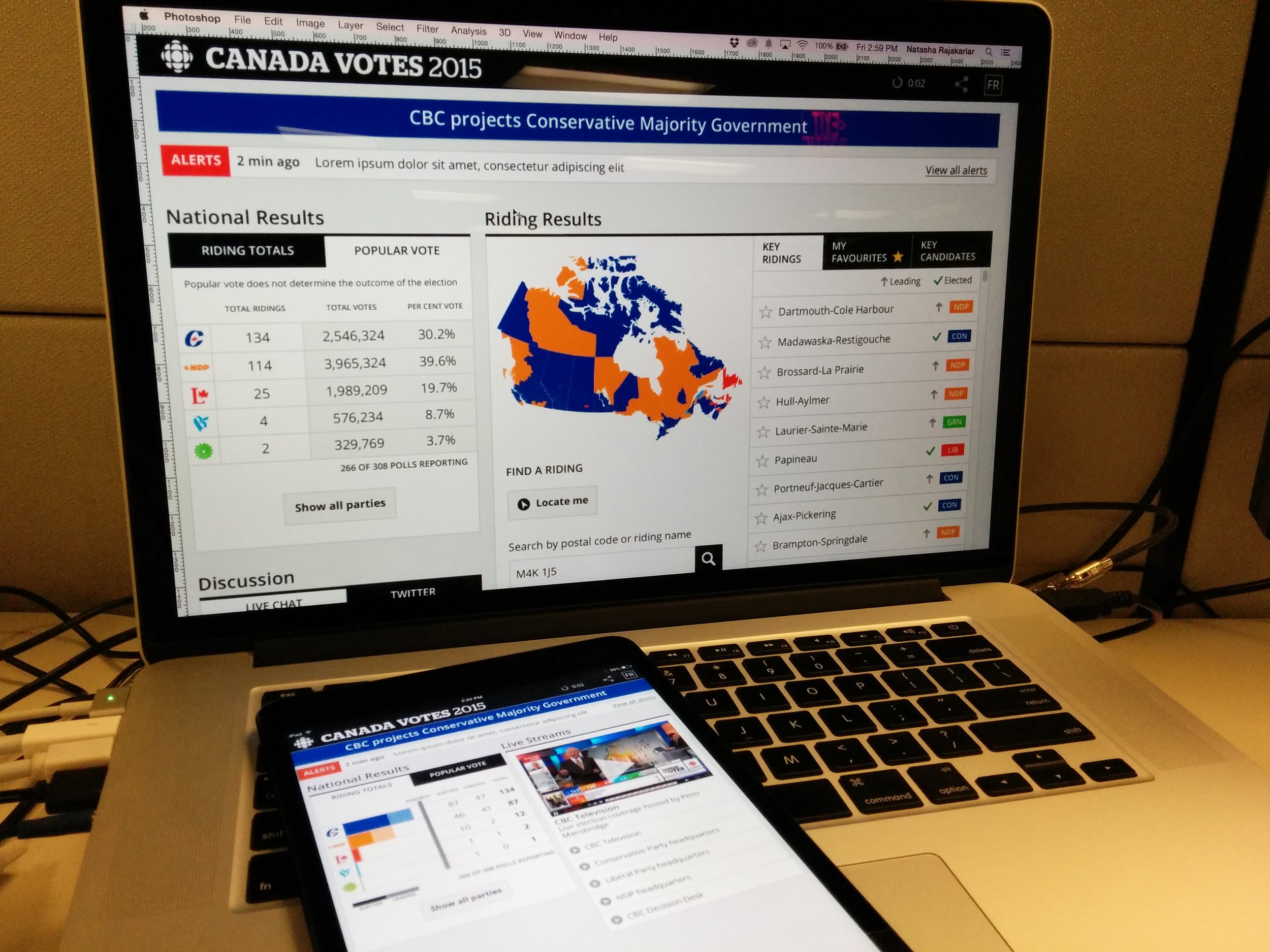
The CBC Election Dashboard was designed for the 2015 Canadian federal election, and allowed users to customize their experience so they could access the data that was most relevant to them.
See the archived dashboard here.
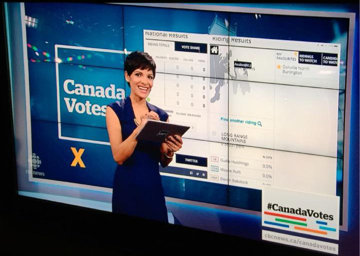
This 30 second timelapse of CBC’s election dashboard captures a large amount of work.
In my role as designer, I was challenged to design an interface that would optimize the presentation of data, while meeting accessibility requirements that are part of the public broadcaster’s mandate.
Project objectives
- Responsive: desktop, tablet and mobile
- Bilingual, English and French
- Accessible (WCAG compliant)
- Easy to use and understand
Process
Initial Sketches
Throughout the project, I worked closely with my colleague Beth Robins, an information architect. In my role as UX Designer, working with an Information Architect like Beth allowed us each to bring forward our individual expertise, while also making sure that we could achieve the best outcome for the user. We began by sketching out ideas. After discussing requirements for the dashboard with stakeholders, we worked through several ideas on a whiteboard before deciding which ones would be well suited for the dashboard.
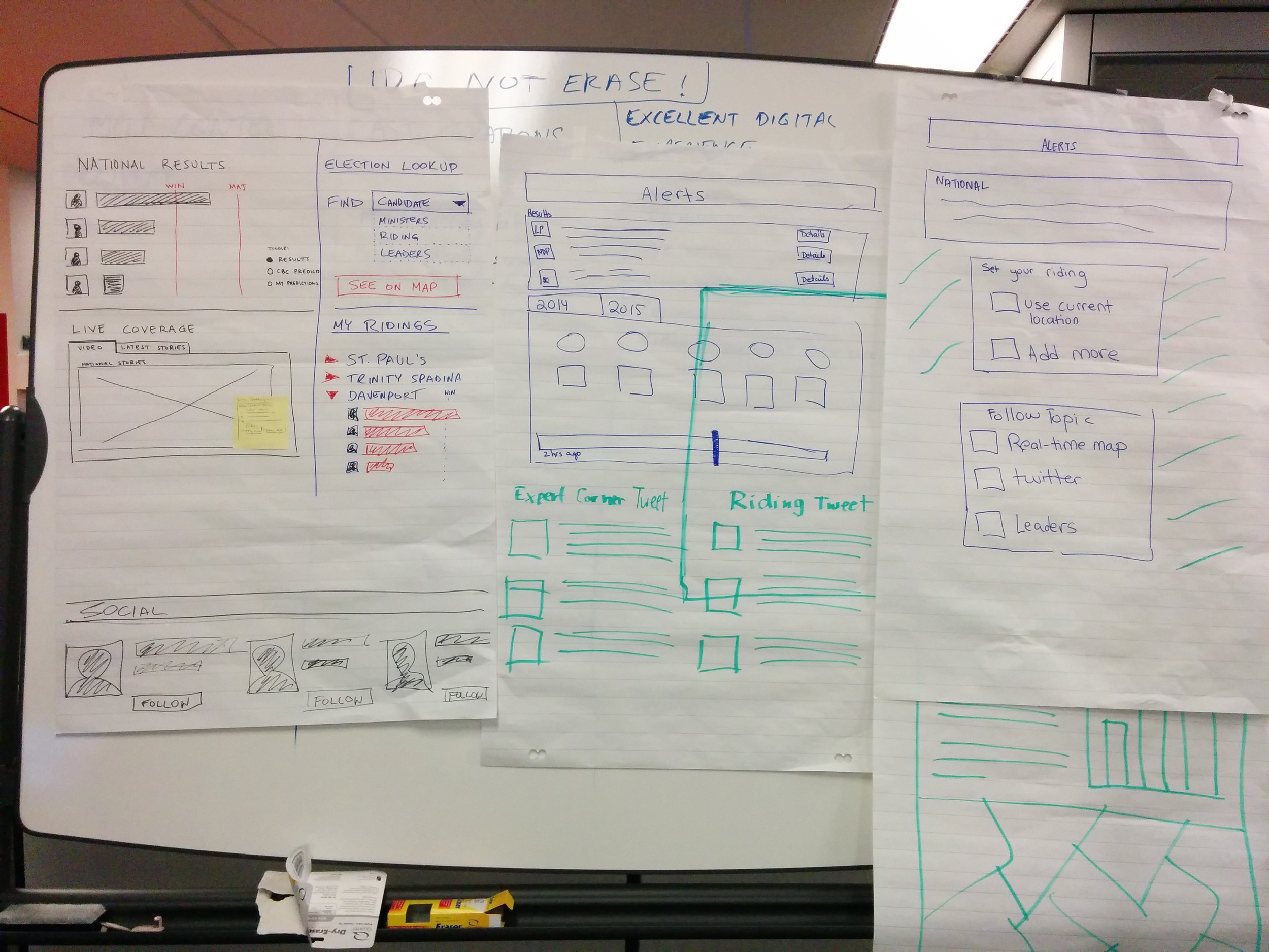
Low Fidelity Mocks
Once we had some ideas that were worth trying, we proceeded to create some low fidelity mock ups. These were used in the first prototypes we tested with users.
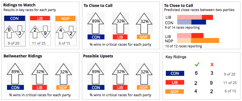
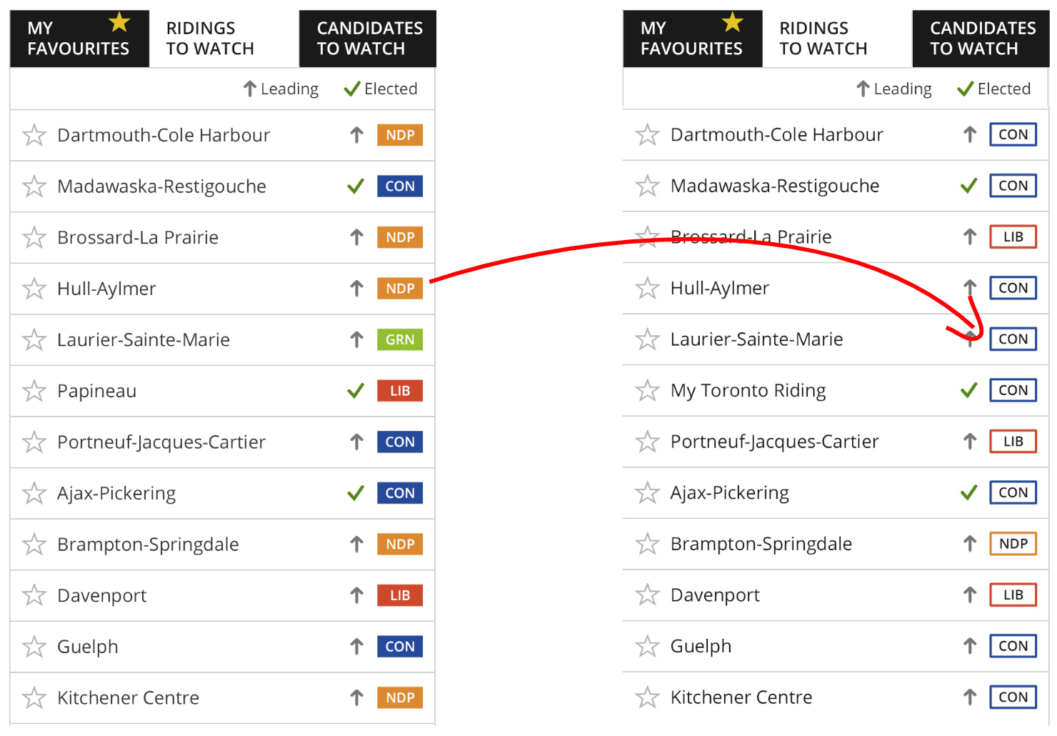
The ‘Ridings to Watch’ component was one aspect in particular where we tried several visualizations of the results, and determined the best way to proceed based on user feedback.
We worked through each component in a similar way, and finally incorporated each ‘module’ into a complete dashboard UI design. Development was able to begin at this point, and we were able to continue refining modules as needed.
Refining Module Designs
One of the main dashboard visualizations was the module for National results — a graph that would present elected and leading parties. In the Canadian electoral system, each riding represents one parliament seat. Ridings on the East coast would have closed first, declaring the “elected” member of parliament, while votes on the West coast were still being counted, showing the “leading” party. To get a majority government, at least 170 seats out of the total 338 would need to belong to one party. One popular solution is to show a horizontal bar, but it isn’t effective at showing the race when there are multiple parties.

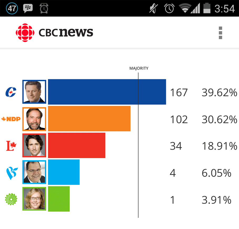
To make it easier to compare the parties visually, we arranged the data in hierarchical order so users could make sense of the information quickly. One of our first attempts incorporated images of party leader in the results chart, but we were advised against it by CBC News election experts since Canadian politics is more party based, and less about the party leader’s popularity.
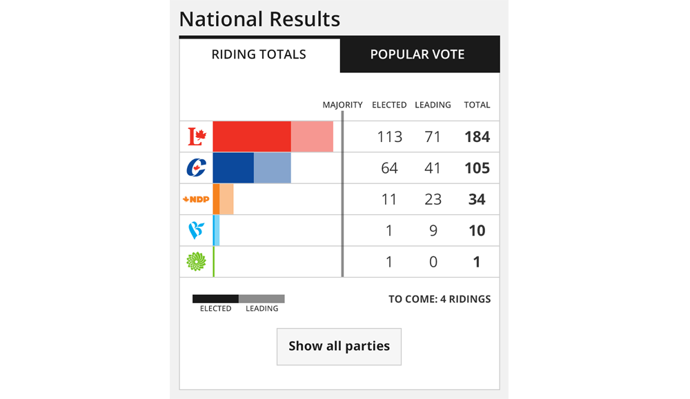
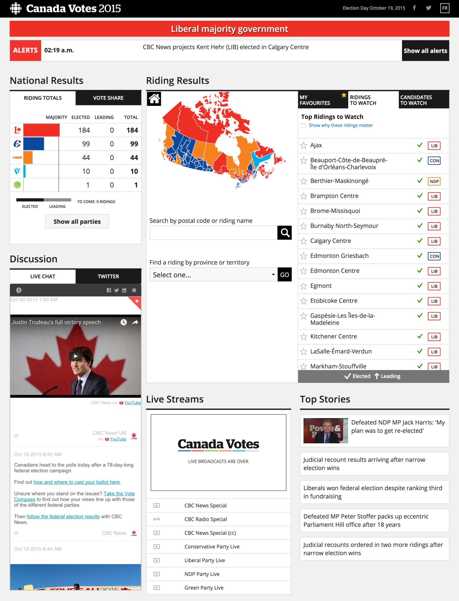
Instead we used only the party logo and party colour, and we reworked the design to show ‘elected’ and ‘leading’ seats separately. Elected seats were represented as a solid colour, and ‘leading’ seats with the same colour in a reduced opacity. The number of seats were also represented as numbers so that users would not have to rely on the visual bar graph alone. Using this solution, the data would drive the design, and the leading party would automatically appear at the top of the chart so that users would know how the election race was going with a quick glance.
Another element that we revised as we were building the dashboard were party labels. All the elements of the dashboard needed to meet accessibility standards, and these labels in particular were problematic. The orange and green party colours consistently fail accessibility contrast requirements when on a white background.
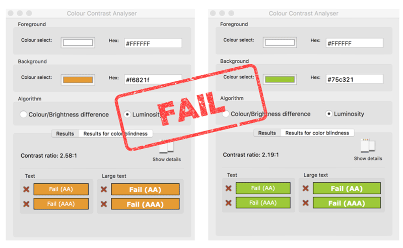
To work around this issue, we used an outline of colour on each label rather than the originally planned solid background colour. This would ensure that colour-blind and low vision users would still be able to see and interpret the labels correctly.
Finally, we tested the dashboard on multiple screen sizes with simulated data to make sure that the modular design specs would adapt appropriately.
Final dashboard design:
As we worked through each module, refinements were made to ensure the best possible user experience, and these changes were incorporated into the final design.
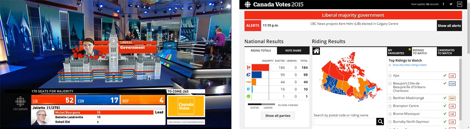
Building on the tradition of broadcast
Translating the well known CBC brand from broadcast to web is not always straightforward. There tends to be a historical view that web products should follow the direction of broadcast visuals, but each medium has very different goals. Broadcast graphics incorporate texture, dimension and movement for a rich television experience, but web interfaces need to be simple enough to present information clearly. In the case of the election dashboard, it was important to keep the design restrained in order to support a large amount of data visualization.
Broadcast media also offers the opportunity to deliver stories around the election that would be interesting to viewers. “Ridings to watch” was one of these features, where editors built up drama by explaining the intricacies of certain ridings, and how they could sway the election outcome. While these stories were very compelling when delivered on television, they were just a list of riding names within the dashboard. As we tested the feature with users, we discovered that users really didn’t care about this in the context of a dashboard, they just wanted their own riding information. In an effort to address the needs of stakeholders while keeping the user informed, we added an option to “show why these ridings matter”. This enabled us to add context for political enthusiasts, while keeping the design uncluttered for users who only wanted their own riding information.
Although broadcast and web maintained different design approaches, the final product was a digital complement to election night coverage.
Project Success
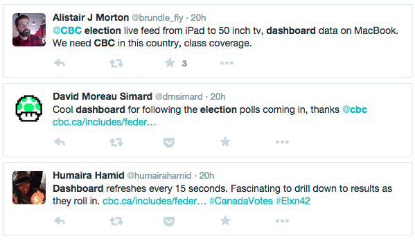
Overall, the project was very successful, with nearly 6 million page views in English, and 2 million in French.
This project won a Gold Medal for Best News Coverage, for “Canada Votes 2015” at the 2016 Digital Publishing Awards
